

Build Your Own Shake —
two surfaces,
one system.
Guests wanted customization. Staff needed a system.
I designed both — because solving one without the
other wouldn't have solved anything at all.
Barry's Bootcamp
Sole Designer
UX & Graphic Design
Shipped · 6 Bay Area Locations
01 — The Problem
Two places.
One problem.
Hundreds of guests attend Barry's daily, but custom shake
requests were handled verbally, inconsistently, and with
no system for staff to follow.
The ask was to improve the experience. What I found was
that the problem lived in two places — digital and physical.
So I designed for both.
02 — Research & Discovery
Mapping the journey before the solution.
I mapped the emotional journey of a frequent guest — from
opening the app to closing it after ordering. The drop was
clear: loyal guests were disengaging at shake selection.
They wanted something new, not another premade option.
That single insight drove everything that followed.

User Persona
Meet Amber — loyal Barry's regular,
bored of the same shake every class.

Emotional Journey Map
Hand-drawn mapping. The drop at
shake selection was the key insight.

Storyboard
Hand-drawn narrative of Amber's
ideal end-to-end experience.
03 — Design Process
Sketches first.
Screens second.
I started with sketches to explore the flow before touching
a screen. Early questions drove the exploration — how does
a guest build a shake without feeling overwhelmed? What
happens when they want more than one?
The grid layout came first. But it buried the Build Your
Own option. The list layout with photography solved both.

User Flow Diagram
End-to-end flow mapping the BYOB feature
into the existing class booking journey.
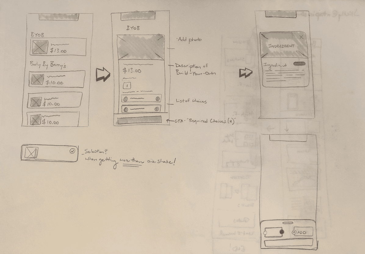
Sketches
Early exploration of the BYOB flow, including
edge case thinking around multiple shakes.

Lo-fi Wireframes
Five key screens before high fidelity —
layout, hierarchy, and the BYOB entry point.
04 — The Solution
Two surfaces.
One system.
Guests pre-ordered in the app. Staff executed from a branded physical form — name, class time, spot number, every ingredient.
One problem. Two mediums. Both designed intentionally.
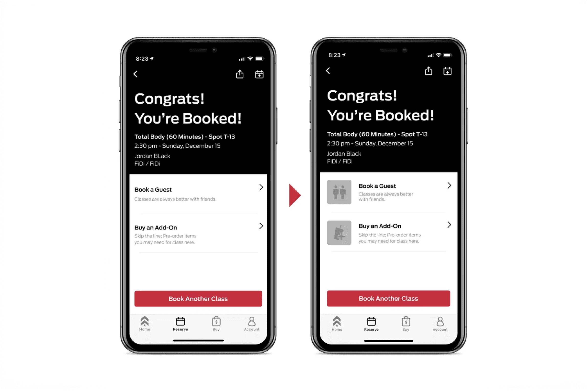
Before / After — Booking Confirmation
Iconography added to drive guests toward the add-on purchase.

Before / After — Shake Selection
List with photography surfaces Build Your Own prominently over text grid.

Build Your Own — Hi-fi Screen
Base, protein, fruits, extras, boosters — with ingredient info overlay.

Physical Order Form — In Use
Real orders. Real guests. The form that made the staff side work.
05 — Testing & Validation
Good design is a feeling.
Validated design is a fact.
I ran an A/B preference test on the booking confirmation
screen. The original had text links. My redesign added
iconography.
90% of users preferred the redesign. The result was 99%
statistically significant — meaning it wasn't luck.
"I like the pictures added to the options at the bottom.
Easier to see what it is rather than just words."
100% of users preferred photography on the shake
selection screen. They wanted to see what they were
ordering. The design just needed to catch up.
90%
preferred redesign
99%
statistical significance
100%
preferred photography
06 — Outcomes & Impact
Real guests.
Real orders.
Real results.
6
Bay Area locations
piloted
90%
preferred redesign
in A/B test
100%
preferred photography
over text grid
"This rocks!"
— Brina, written in the notes field of her order form
That's the outcome I'm most proud of. Not the screens.
Not the data. The moment a real person experienced
something I designed and felt delighted enough to say so.
07 — What I Learned
What I'd do
differently.
I believed in this idea from the beginning.
Looking back, I wish I had pushed it further.
The pilot worked. Six locations proved the concept.
But I didn't take it to corporate — and I think it
could have gone company wide with the right evidence.
More user interviews. Harder data on food cost savings.
A business case strong enough to walk into a boardroom.
Good design solves problems.
But design with data behind it changes companies.