

"Make the app do the thinking
so the user doesn't have to."
Design philosophy — inspired by Steve Krug's Don't Make Me Think
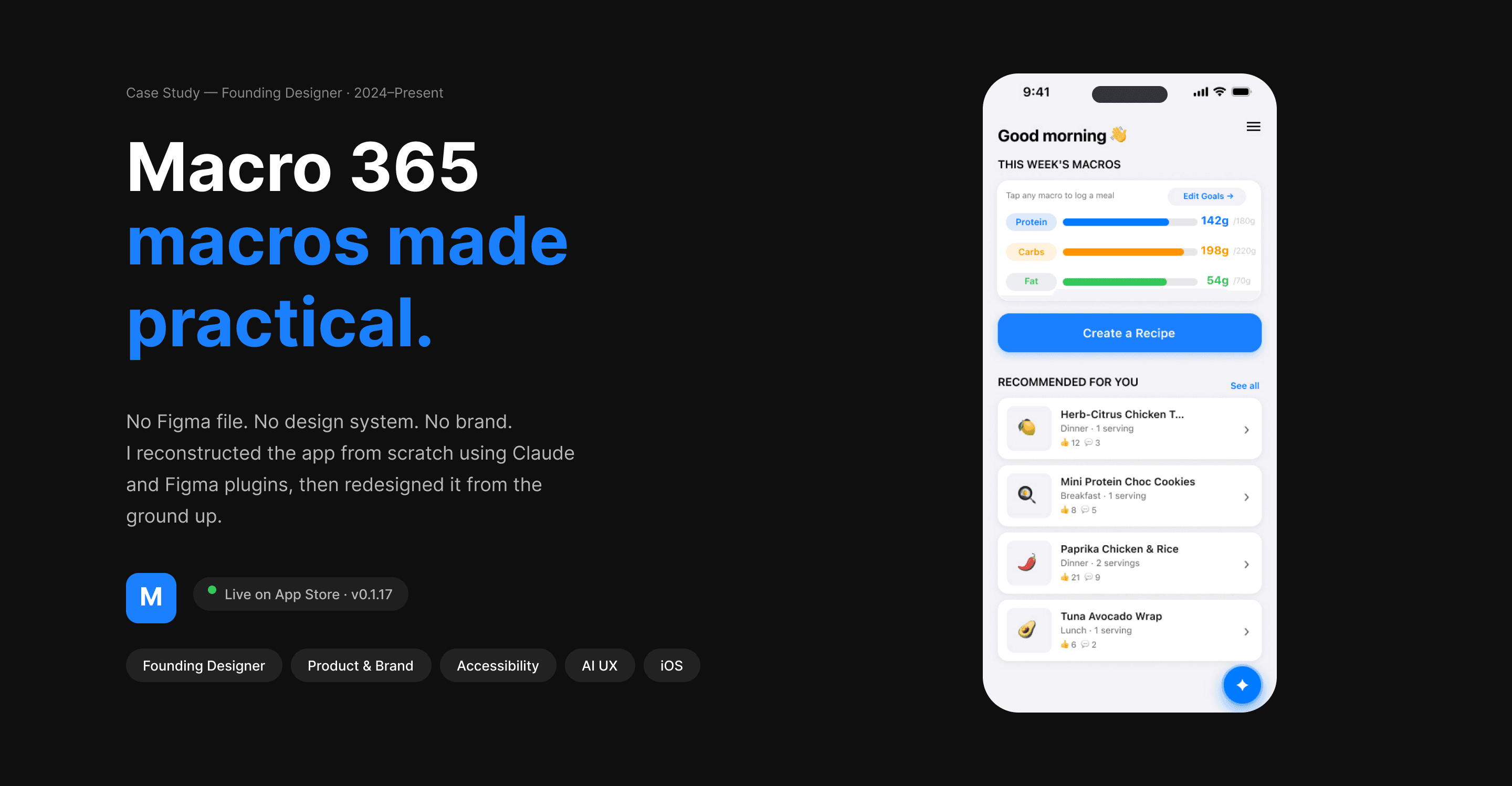
— First look · the product at a glance

Home screen
Original build — reconstructed
from screenshots using Claude.

Redesigned Screens
Home screen version 2
Redesigned — accessibility steps made, branded, proactive from the ground up.
Redesigned — Daily targets updated, but accessibility issues remained.
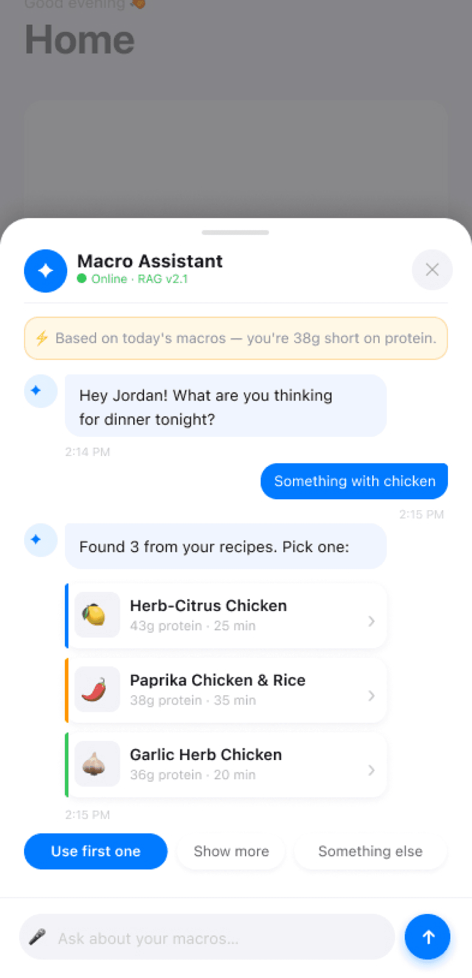
Redesigned AI Assistant
Proactive recipe suggestions based
on your macros and pantry today.
02 — Before & After
No file.
No system.
No brand.
Built from scratch.
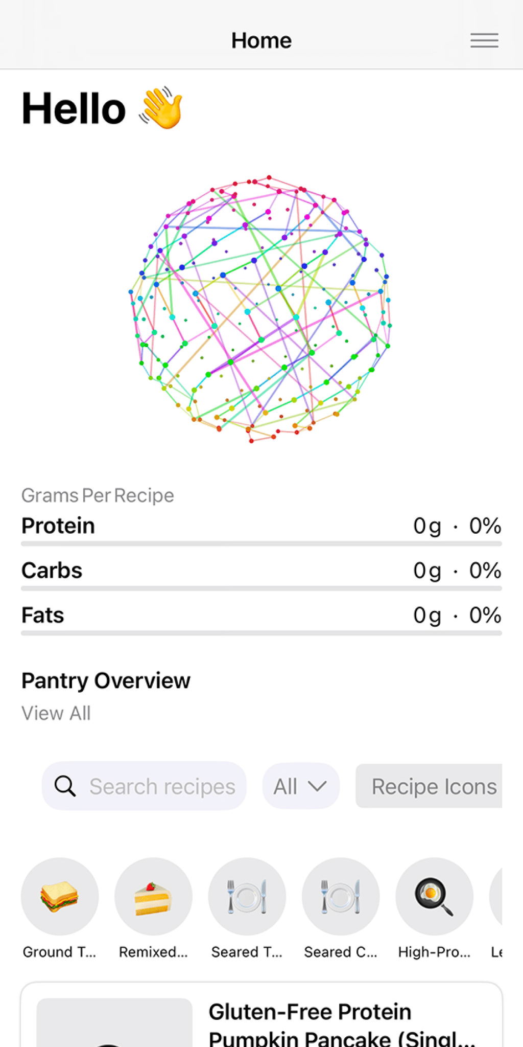
The app was built entirely in code. There was no Figma file. I reconstructed every screen from scratch using Claude and Figma plugins before I could redesign a single one. That process revealed every problem at once.
BEFORE — Original build
— No Figma file · reconstructed using Claude + Figma plugins
— Gradient background · white text failing contrast
— No brand system · no color language · emoji as icons
— 0 accessibility standards applied
AFTER — Redesigned
✓ Full design system built in Figma from zero
✓ WCAG AA · 28 contrast fixes applied
✓ Color-coded macro language — blue / orange / green
✓ "Fits today" badges · proactive insight surfaced
— Before & after · Home screen
Original home screen
Gradient card. Emoji icons.
No brand. No accessibility.
Redesigned home screen
Color-coded macros. "Fits today"
badges. Clean system background.
The same app.
A completely different product.
Left: reconstructed from screenshots.
Right: a system built from nothing.
Every design decision visible in a single comparison.
03 — The Work
Three decisions. One north star.
01
Accessibility first
I introduced WCAG AA contrast standards to the product. 28 contrast failures fixed on the home screen alone. The gradient came down. The product became readable. This was the foundation.
02
Color is communication
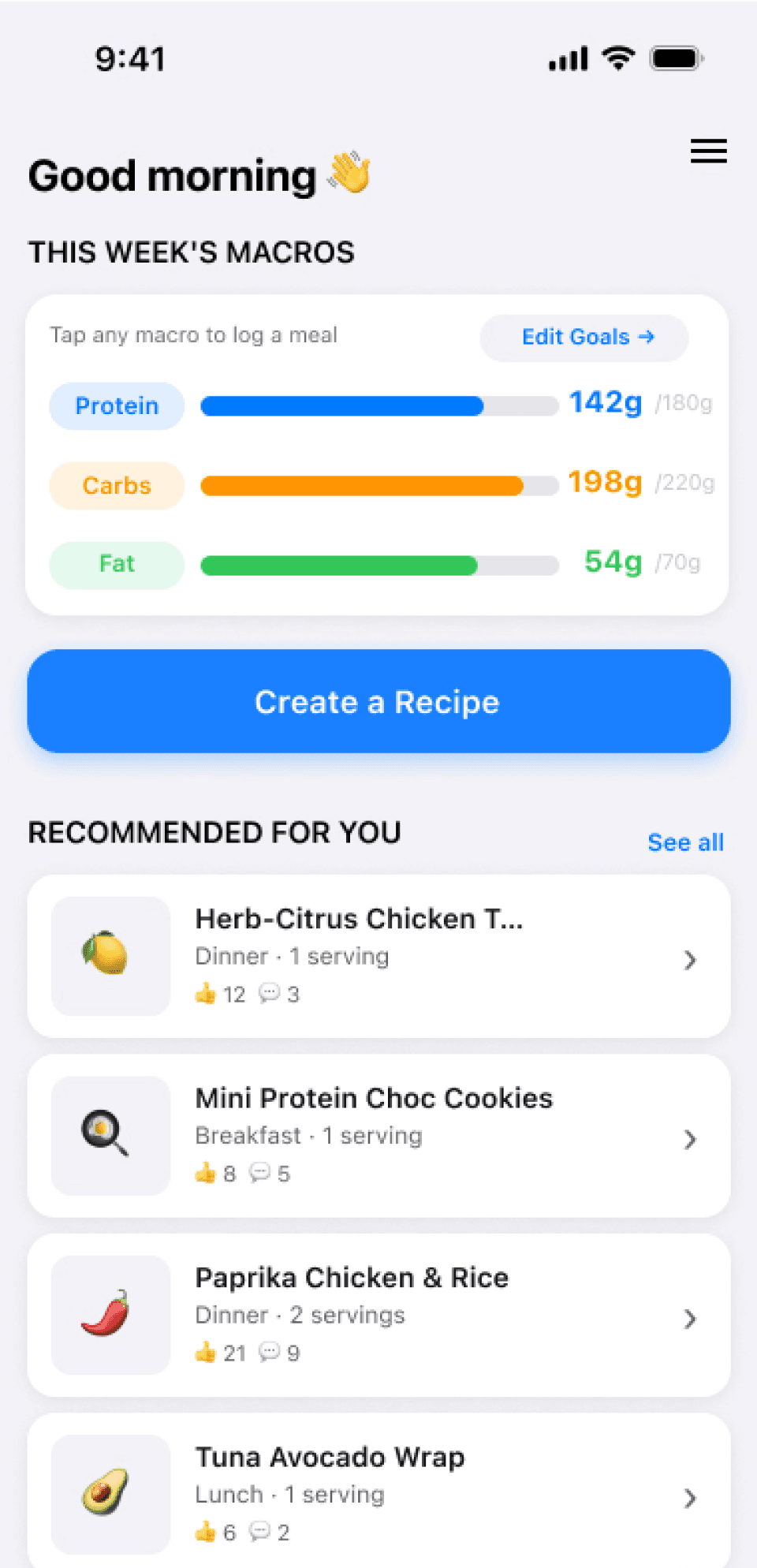
Blue for protein. Orange for carbs. Green for fat. Users read their week's progress in a glance without parsing a single number. Color does the work of a full data visualization.
03
Proactive over reactive
The "fits today" badge answers the question before the user asks it. The protein gap appears before they look. Every screen asks: what does the user need right now — and how do we surface it?
— The decisions in the product

Current home screen
Color-coded bars. Custom color selection (green shown)
Weekly progress at a glance.

Pantry — proactive insight
"Protein gap: 38g this week."
Surfaced before they go looking.

Goals — setup flow
Auto-calculated calories from macros.
Minimal friction to first value.
04 — Design System
Color that works
harder than text.
Every macro has a color that carries across every screen. Users don't read the number first. They read the color. That's the design doing its job.
Protein
142g
/180g target
Carbs
198g
/220g target
Fat
54g
/70g target
05 — Stakeholder Collaboration
The animation
wasn't wrong.
The placement was.
The original build included a globe animation — a colorful constellation sphere that was genuinely well-crafted. My job wasn't to kill it — it was to find where it actually earns its place. On the home screen it competed with the user's goal. On the recipe generation loading state, it fills dead time with personality and signals that something intelligent is happening.
The animation didn't change. The context did.
HOME SCREEN — Removed
Globe animation sits between the greeting and the macro tracker. Beautiful. But the user came here to check their macros and find a recipe. The animation stops them cold. Decoration on a utility screen is friction.
RECIPE GENERATION — Right home
The user tapped Create. The AI is working. Dead time. Here the animation earns its place — it fills the wait with personality and signals that something genuinely intelligent is happening in the background.
— The animation · two contexts
Home screen — removed
Globe on idle screen.
Decoration as friction.

↓ paste screen here
↓ paste screen here
Recipe generation — right home
Globe during AI wait state.
Communication, not decoration.
Same animation.
Two contexts.
One is decoration.
One is communication.
Relocating the animation to the
recipe generation screen was right
for three reasons: the user is waiting,
the AI is working, and the animation
communicates that something intelligent
is happening.
06 — Outcome
Live. Shipping.
Still solving.
The hardest problem is next.
The pantry flow is still too manual. The most powerful features stay hidden until the pantry is built. Making the value visible from session one — before the user has done the work to earn it — that's what I'm solving now.
28
WCAG AA contrast
fixes applied
3
Channels in
brand audit
5
Core screens
designed & shipped
Live
App Store
v0.1.17 active
07 — Vision for the future
More accessible. Simpler UI.
The next version of the product.
Home
Cleaner macro tracker.
Less visual noise, more clarity.

Create Recipe
Simplified pantry-first generation.
Fewer taps to first recipe.
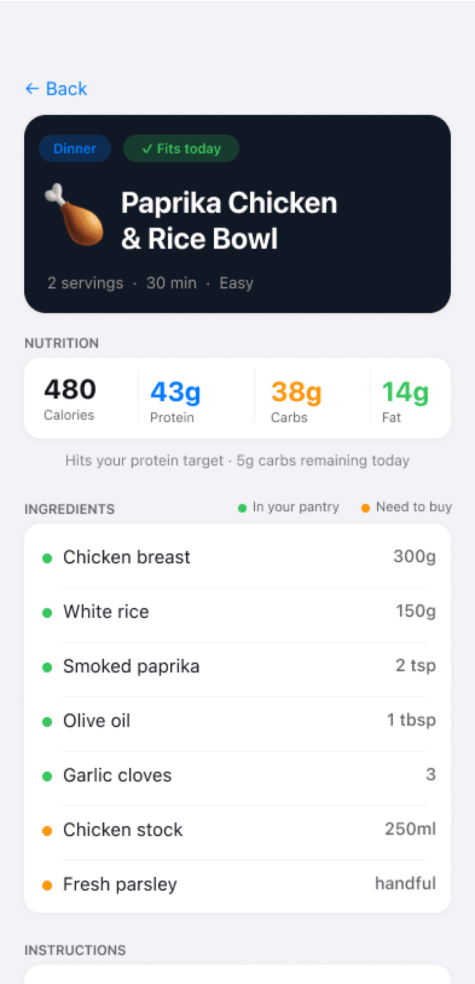
Recipe View
Generated recipe - shows ingredients and instructions.
Current status
Solving the pantry flow · Building the design system · Brand audit in progress
Active project