← Back to work
Redesigning how customers
get help before calling
NICE CXone's white-label chat widget was a single channel in a world where customers expect to choose. I designed the multi-channel self-service experience that let businesses deflect call volume and let users solve problems on their own terms.
COMPANY
NICE CXone
PRODUCT
Guide — Digital Engagement
ROLE
UX Designer
FOCUS
Channel Selection UX
03 — Exploration
Finding the right pattern
for channel selection
The central challenge was how to present channel options that scaled gracefully. A business might offer one channel or six. The solution had to work for both without becoming cluttered or creating decision paralysis at the worst possible moment — when a user is already frustrated enough to seek help.
EARLY EXPLORATIONS

Rectangular CTAs and pill buttons worked for 2 channels. They broke down visually at 4+, creating the push toward a scalable icon-based solution.
COMPLETE CHAT FLOW
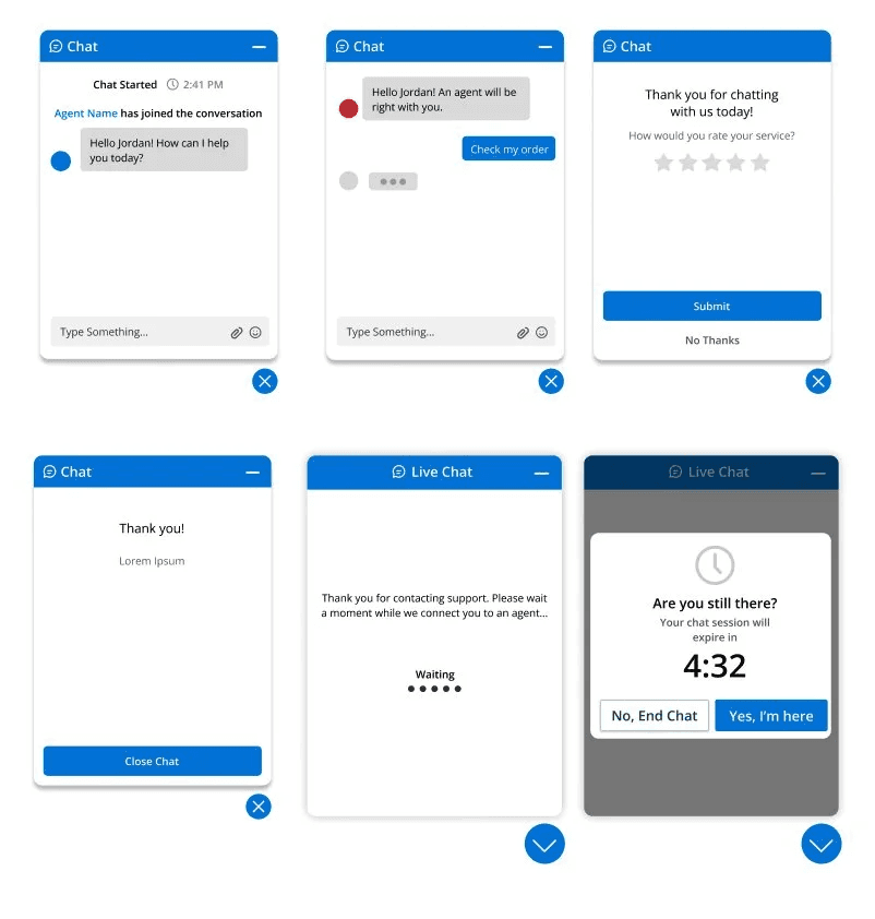
Beyond the entry point, I designed the complete chat journey — waiting states, active conversation, session timeout, and post-chat rating.


01 — The Problem
Agents were drowning in calls
that didn't need to be calls
Customer service agents at businesses using NICE CXone were overwhelmed. A significant portion of inbound call volume consisted of questions that could have been answered without a human — if users had been given the right tools and the right path to find answers themselves.
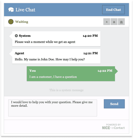
The existing widget offered a single touchpoint: chat. No self-service options. No help articles. No way to reach a business through the channels users were already using every day. The product needed to evolve from a chat window into a true self-service gateway.
BEFORE — SINGLE CHANNEL, DATED UI
AFTER — MULTI-CHANNEL SELF-SERVICE
Agent overload
High call volume prevented agents from focusing on complex issues that genuinely required a human.
One channel, one option
Users were forced into chat regardless of their preference or which channel they were already using.
No self-service path
There was no way for users to find answers independently before escalating to a live agent.

02 — Process
Mapping the journey before
designing the interface
Before touching a screen, I focused on understanding the two paths a user could take — finding an answer themselves, or connecting with an agent. Mapping these paths revealed where the existing widget created dead ends and where the new design needed to intervene.

Storyboard — real-world context
Sketching the user journey from a real moment of friction revealed the widget had to work in low-attention, high-frustration moments.

User journey map — two paths, one entry point
Defined two primary flows: article-first (self-service) and agent-first (live help). The widget needed to support both without forcing a choice upfront.
06 — Results
Fewer contacts. Faster resolution.
Less agent burden.
The Guide product — of which this channel experience was a core component — delivered measurable outcomes across the customer service journey.
89%
Self-service success rate
Users resolving issues independently without reaching a live agent
30%
Reduction in contact volume
Fewer avoidable calls and chats reaching the agent queue
Fast
Time to adjust guidance
Business teams update rules without engineering cycles
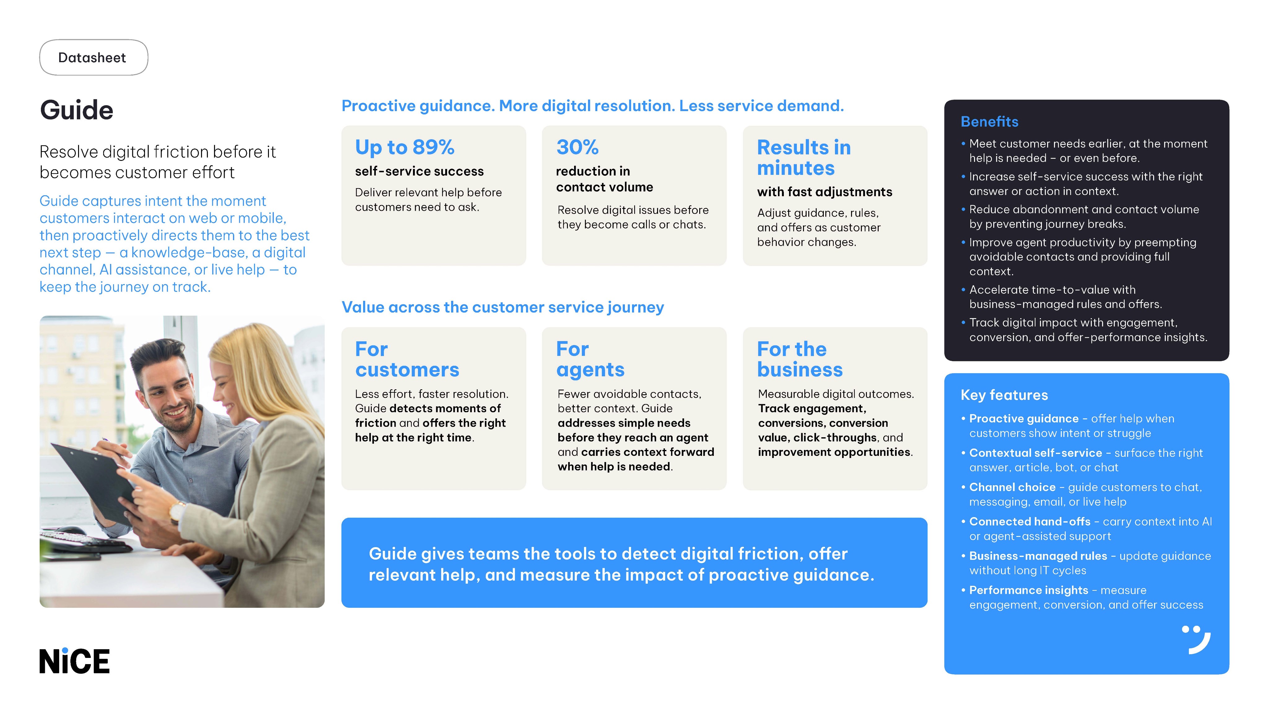
Product in market — NICE official collateral
This work shipped. NICE featured the Guide product — and the channel experience at its core — in official sales and marketing collateral distributed globally.
→ Drop: Nice_Data_Sheet_-_pg_1_Page_1.jpg
→ Drop: Nice_Data_Sheet_-_pg_1_Page_2.jpg
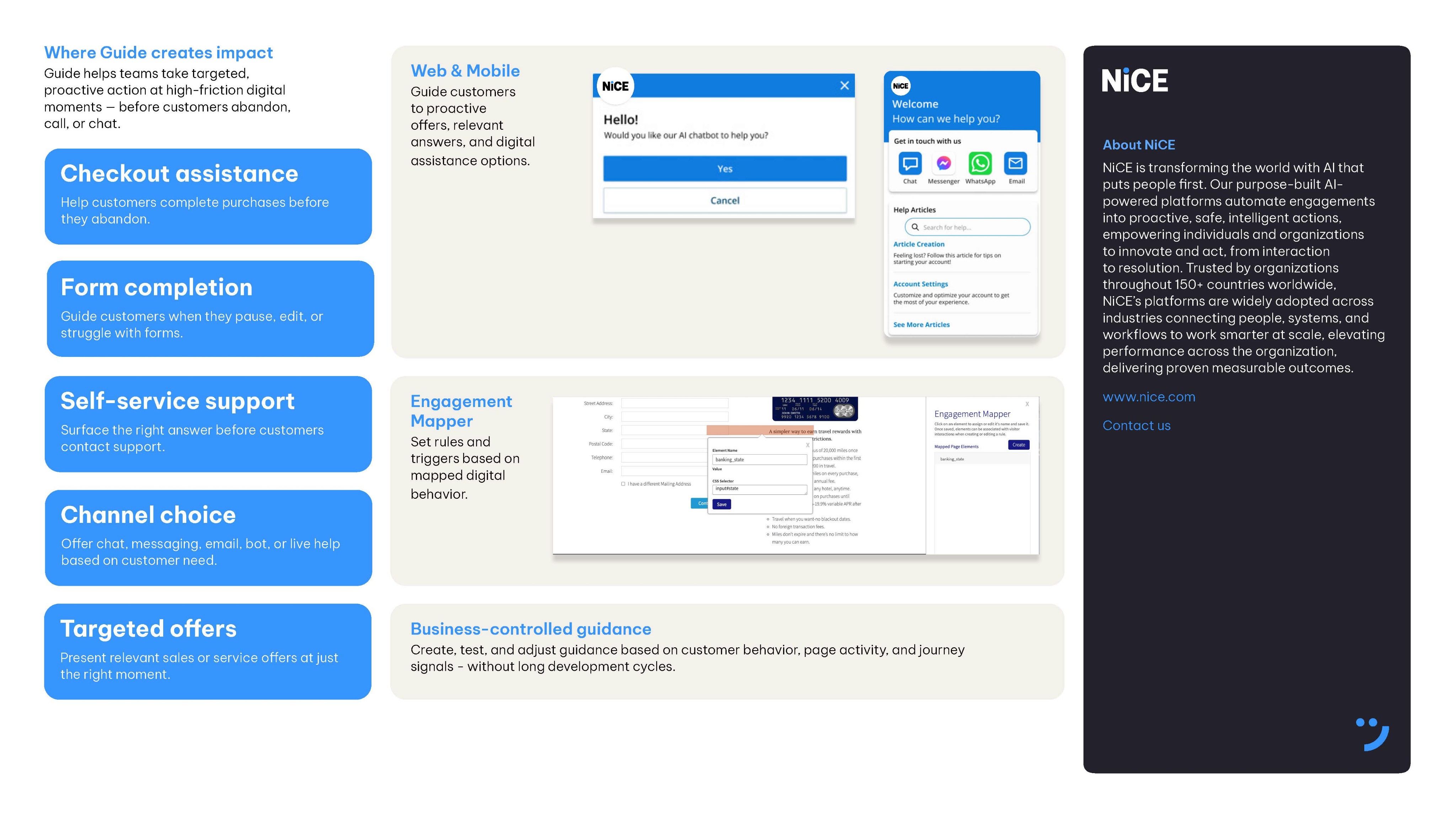
NICE CXone — Guide Product Datasheet · Official sales collateral · Featuring the channel experience and self-service widget designed as part of this project
07 — Reflection
What I'd do differently
Shipping is the beginning of learning, not the end. Looking back with fresh eyes, there are three areas I'd push further given the opportunity.
01
Grid system rigour
The grid needed more intentional definition from the start. As configurations varied across business clients, inconsistencies in spacing became apparent. A more robust grid foundation would have made the widget more resilient across all configurations.
02
User testing at scale
I would push for testing specifically around the multi-channel selection moment — particularly at four or more channels — to validate whether the app icon pattern continued to hold up or needed refinement.
03
More edge case coverage
What happens when a channel is unavailable outside business hours versus permanently removed? How does the widget behave if a device doesn't have the relevant app installed? These states deserved explicit design decisions.
05 — Design System Contribution
Designing a system built
for every brand
Because this was a white-label product, the widget had to work for any brand — any color, any typeface, any configuration. I contributed to the NICE CXone design system to ensure these components were themeable by design, not as an afterthought. Every token, state, and variant was built to be overridden without breaking the experience.
SCALABLE VARIANTS
1 channel
Chat
2 channels
4+ icons
Channel selector — scalable variants
One component that scales from a single CTA to an icon grid — any business configuration without breaking the layout.
WHITE-LABEL THEMING
Color token system — white-label ready
Every color is a token. Business clients override the palette without touching component logic — theming at the token level.
WCAG 2.1 AA
Aa
White on Blue
5.2:1
AA
Aa
White on Dark
14.8:1
AA
Aa
Dark on White
14.8:1
AA
Aa
White on Error
4.8:1
AA
Accessibility — contrast validated across all themes
All white-label color tokens validated against WCAG 2.1 AA — so clients can't accidentally ship inaccessible experiences.
CXone Guide — Component Library · White-label · WCAG 2.1 AA · Contributed alongside the Design Systems Manager
04 — Solution
A self-service gateway built on
familiar patterns
Users interact with apps on their phones every day. They already understand what a WhatsApp icon means. Bringing those familiar app icon patterns into the widget eliminated the need to explain each channel option. Recognition beats instruction — especially when someone is already frustrated enough to seek help.

App icons over buttons
Spatially efficient and universally recognized — icons scale from 1 channel to 8 without the layout breaking or creating cognitive overload.
Mobile-first conventions
Designed to feel native to mobile contexts where most users encounter it. Familiar patterns reduce friction at a high-stress moment.
Search & help articles
Self-service content surfaces directly in the widget, giving users a path to resolution before they ever need to contact a human.
Designed for edge cases
Unavailable channels are greyed out with clear messaging so users are never left confused by the system's own state.