
← Back to work
01 — The Problem
Pluralsight cart -
rebuilt for conversion.
Pluralsight's checkout couldn't handle promo codes, add-ons, multiple products, or pricing clarity across four billing models. I was brought in to fix that — and ship it in six weeks.
01 — The Problem
The whole funnel needed work.
Even when users reached checkout, the cart didn’t meet the business needs — no promo codes, no add-ons, and confusing pricing across four billing options.
I jumped in to fix all that. Teaming up with a PM and working across teams, I revamped the entire purchase flow — from the first click to subscription confirmation — and designed a social sign-on flow for the future that the engineers haven’t built yet, but will.
Pluralsight was losing users before they even got to the cart. The account setup had too many steps, no social sign-in, and no way to recover if someone bailed halfway through.
02 — The Constraints
The constraints I was working inside.
01
6-week hard deadline
Launch was fixed. Every decision was a trade-off between doing it right and doing it on time.
02
Two design systems
Marketing's system was editorial. Product needed components that handled state, error, and interaction.
03
Cross-team setup
Pulled from my product team, embedded with a FinTech team. They knew payments. I knew the user.
04
Four billing models
Monthly, annual, B2B, and B2C — all in one flow. Each needed to feel obvious, not overwhelming.
04 — The Work
ACT 1 — Entry Point & Account Creation
Cross-functional collaboration with a PM. I redesigned sign-up from scratch and initiated a future-state social sign-on flow — not in scope, not yet built, entirely my idea.
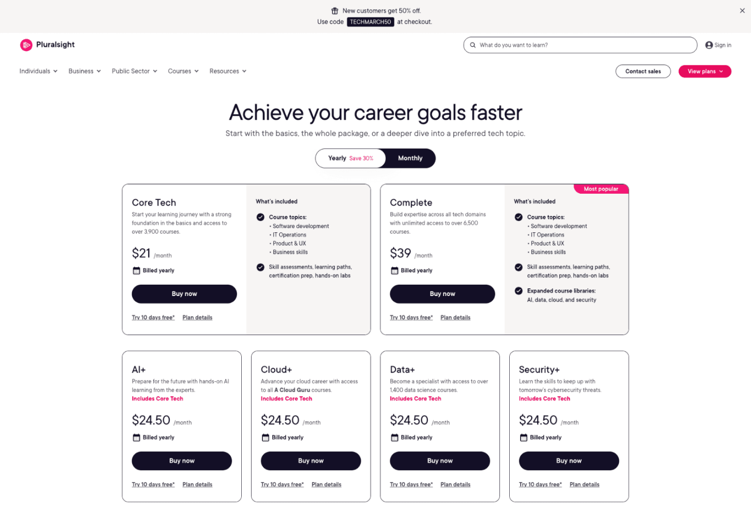
Pricing Page — Updated Entry Point
The entry point. Updated to reduce friction before a user ever hits the cart.
Sign-Up Modal — Default

Email capture first. Progressive disclosure keeps the form from feeling overwhelming.
Sign-Up Modal — Expanded

Name and password revealed after email.
ACT 2 — The Cart
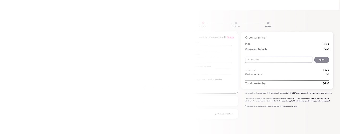
The core work. Promo code flow built from scratch. Pricing clarity across four billing models. B2B add-on architecture. Trust signals at the payment step.
ACT 3 — Beyond the Brief
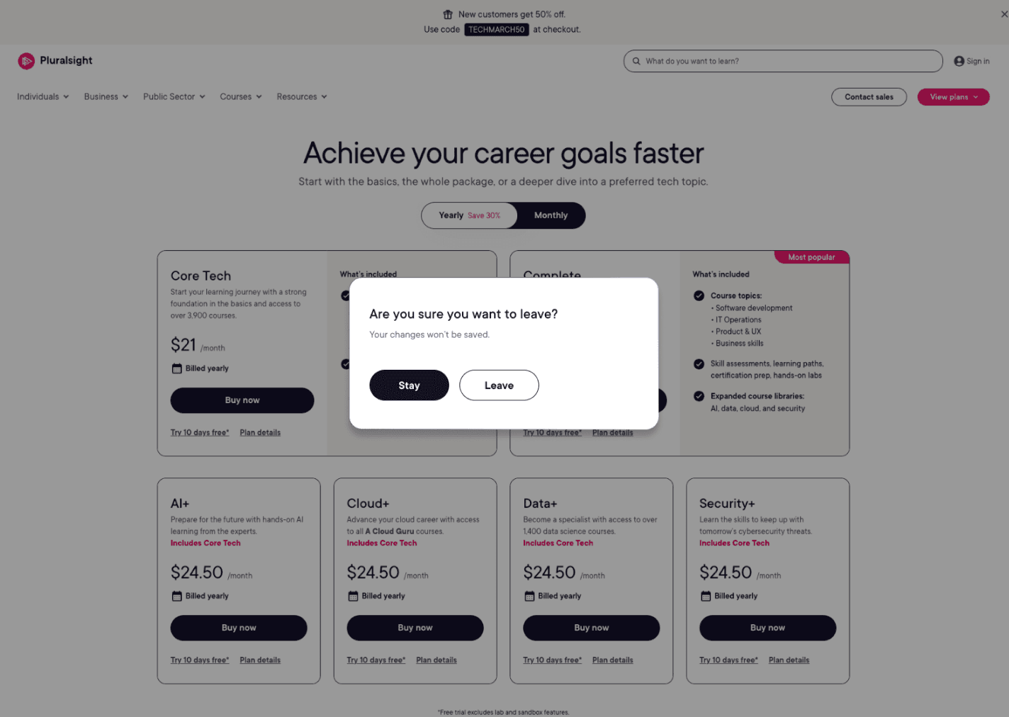
Exit Pop-Up
Recovery flow for users who abandon mid-sign-up.
Social Sign-Up
Future state — social sign-on.

Social Sign-Up
Multiple sign-on paths. Initiated beyond scope.
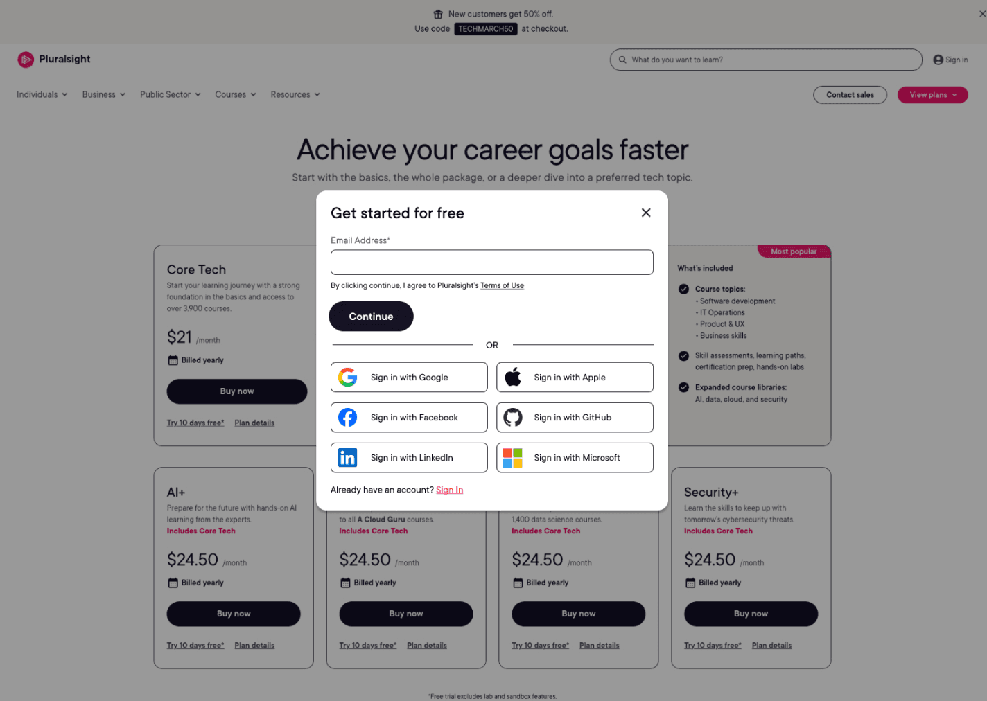
Designed because I saw the opportunity — social sign-on and exit recovery flows.
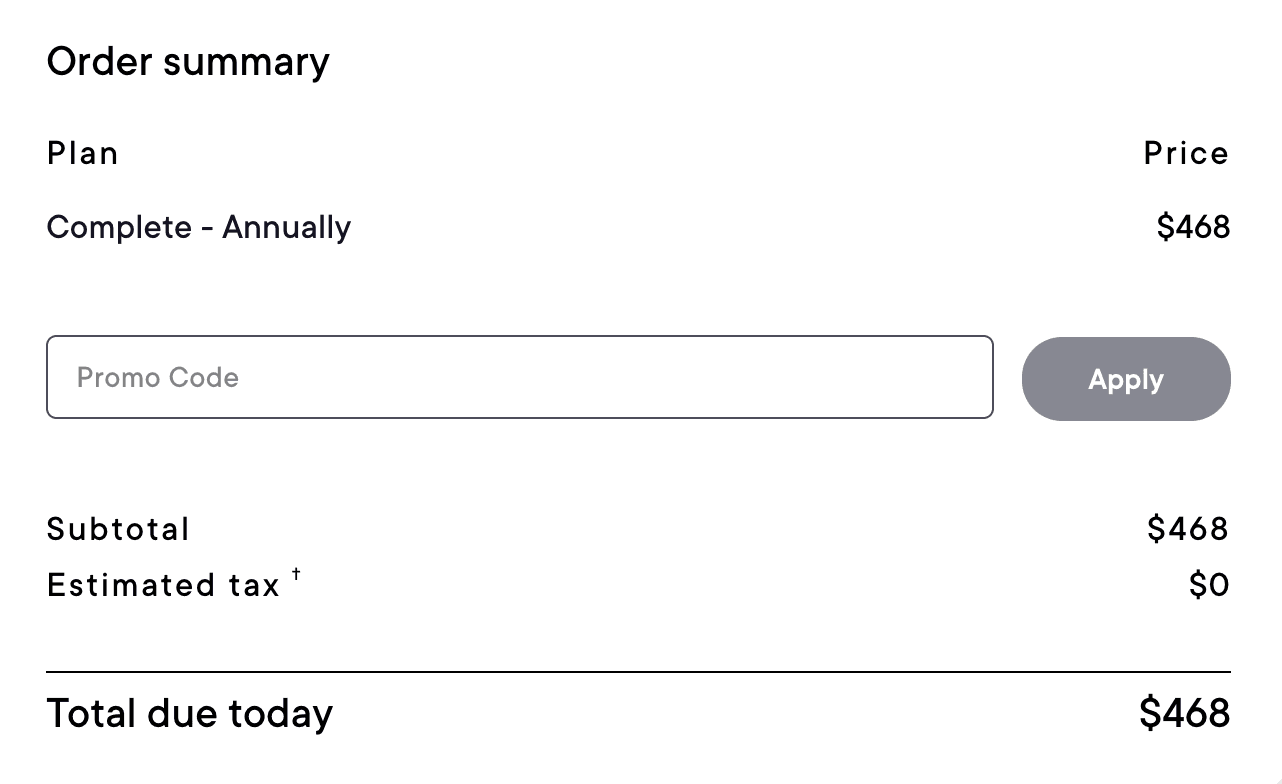
Promo Code Flow — Default & Applied
Dynamic Information
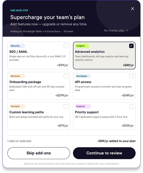
B2B - Extra Products & Add-Ons
Promotional Modals


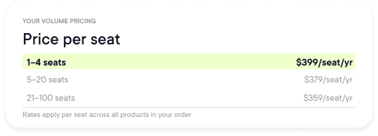

Default: yearly/monthly toggle surfaces the pricing decision upfront. Applied: $0.00 total with 10-day trial badge — billing clarity at the exact moment users hesitate.
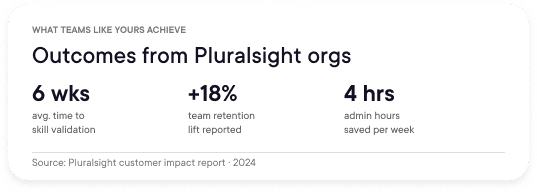
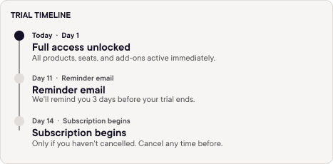
Context cards surfaced at the payment step — AI Academy upsell, volume pricing tiers, trial timeline, and team outcomes data. All designed to build confidence at the moment of decision.
Two products, two seat counts, configurable add-ons. One summary. The cart handles B2B complexity without making the user do the math.
B2B upsell. Six add-ons, two exit paths, zero pressure.
$0 surprise fees. Spelled out explicitly.
04b — Purchase Summary Redesign
Before and after.
The original cart: one plan, one flat price, no context. The redesign handles multiple products, seat counts, add-ons, volume discounts, and a promo code flow that had never existed at Pluralsight.
BEFORE
AFTER
Order Summary — Original
Purchase Summary — Redesigned

— Flat price — no breakdown
✓ Multi-product + per-seat pricing + seat controls
— No billing period toggle
✓ Yearly/Monthly toggle with volume discount
— No promo code flow
✓ First promo code flow — built from zero
— Static total — no trial clarity
✓ Trial Timeline + trust badges at peak anxiety
05 — Impact
What the cart can do now that it couldn't before.
SHIPPED
→ First promo code flow in Pluralsight's cart history
→ B2B add-on selection with live price feedback
→ Pricing clarity across all billing models
→ Trial Timeline — billing trust surfaced at the payment step
→ Elevated CTAs and chip system to drive engagement
→ Mobile-responsive cart from the ground up
WOULD BUILD NEXT
→ Apple Pay + Google Pay — fewer steps to payment
→ A/B test Trial Timeline placement
→ Promo code analytics from day one
→ Error state usability testing at scale
06 — Reflection
What I'd change. What I learned.
The most important thing I did on this project wasn't design a screen. It was reframe a pushback.
When I argued for stronger CTAs and higher-contrast chips, I didn't say "this looks better." I said "passive UI in a checkout flow costs conversions." That's the difference between a designer who executes briefs and one who shapes them.
"The brief was: fix the cart. The real job was: build something that earns trust fast enough to close."